Showing posts with label Home Decor. Show all posts

Wednesday, 8 November 2023

3 factors to consider when redesigning your stairs


A hand holding a paint roller  Description automatically generated
Fallen out of love with your staircase?

With Christmas just around the corner, you might not be able to splash out on a brand-new staircase design. But the good news is, if your existing flight is structurally sound, you don’t necessarily need to…

For example, adding a fresh coat of paint will help to conceal any chips or grubby marks that may have appeared over the years.

Another popular option for renovating staircases in Glasgow and beyond would be to replace outdated spindles with more modern alternatives. Or why not replace spindles with toughened glass panels to give your hallway a more opulent look?

Whilst there are lots of ways you can renovate your stairs, there are a few important factors you need to consider first.

Let’s take a closer look.

1.Budget
Rule number one when redesigning your stairs is to set yourself a realistic budget. This will help to keep your project on track from beginning to end, preventing you from overspending and entering 2024 feeling more skint than ever before.

If you’ve only got a small budget to work with, repainting the existing frame of your staircase is a cost-effective option that will give your hallway a new lease of life.

For those who have more spending room, you could swap old spindles for new ones, clad over the structural sides of your staircase, or reclad the treads and risers with non-slip oak – enhancing both their safety and appearance.

2.Safety
Do you share your home with children, pets, and/or elderly relatives?

When renovating your staircase, you must factor in the needs of your entire household and which materials and finishes will be the safest for them.

Though they look stunning, hardwood treads can be slippery – posing a serious slip hazard for little ones, furry friends, and older family members. Carpet, on the other hand, is a fantastic solution for minimising the risk of falls on the stairs, and it also creates an uber-cosy feel.

Not sure your budget will stretch as far as carpeting every step? Not to worry – adding a carpet runner down the middle will provide a better grip for users as they go up and down the stairs. Depending on your chosen fabric, pattern, and colour, it can create a stylish focal point, too – giving you the best of both worlds!


3.Experience
Have you ever renovated a staircase before?

Although it depends on the scale of your project, you might only need a few basic DIY tools and skills to get the job done.

However, it’s important to know your limitations and hire a professional when the project is too big for you to complete single-handedly.

Take Abbott-Wade, for instance. Their staircase specialists have helped many homeowners transform their staircases in Glasgow (amongst various other locations in the UK), and they’d love to do the same for you.

You’re more than welcome to discuss your staircase ideas in further detail with their team – and if you need an expert opinion on the safest (yet trendiest) materials and colours, they will gladly assist you.


*this post contains PR samples and/or Affiliate Links unless indicated otherwise - you can learn more on my Disclaimer page.

Tuesday, 28 March 2023

Creating A Beauty Room (Or Space) In Your Home And What You Should Consider

Within a home, there are many dream spaces we all would love to create. One of these could be a beauty room. There might be a small spare room in the house that you want to turn into the beauty room of your dreams. A place you can retreat to when you want to get ready for the day or an event. If you don’t have additional rooms, you could turn part of your bedroom or spare room into your ideal beauty space.
Creating A Beauty Room (Or Space) In Your Home And What You Should Consider
image credit 

For those looking to create a beauty room (or space) in their home, here are a few key factors worth considering to help you get started.

Fresh Coat Of Paint
Adding a fresh coat of paint to a room can make a noticeable difference. The space can be brighter almost instantly, and the walls look a little cleaner. Choose a colour that suits the aesthetic of your beauty room. Along with a fresh coat of paint, you might also decide to wallpaper one of the walls. This could make a nice feature wall and backdrop for any glam photos you want to take. Wallpapering can be tricky to get perfect. Trying to align the paper, so the prints match and blend seamlessly can be a stressful experience.

To avoid this stress and ensure the wallpaper matches, you could recruit professional help. Search MyBuilder for painters and decorators near you to not only add your wallpaper but paint your walls as well. This way, you can rest assured that your beauty room will have no air bubbles on the wallpaper or slightly patchy paintwork on the walls.

Choice Of Vanity
One main component of a beauty room or space is the vanity. The space where you sit and store your beauty belongings. You should choose one that fits in with the space's aesthetic and is durable.  

Spend time searching for the ideal vanity unit, but ensure you have measured the space first. This helps you avoid finding the perfect vanity only to have the heartbreak of it not fitting the space you wanted.

In addition, look for additional storage units to go next to or under your vanity. These can be a great addition to any other beauty products and tools. You can store them in easy-to-access spaces, which helps to keep the space clean and tidy.  Plus, before adding additional items, think about using a TV Rental to make the most of the space you have, before looking for a permanent solution.

Plenty Of Light
Without question, one of the most crucial aspects to consider when creating a beauty space or room for yourself is lighting. The right lighting makes the biggest difference. Not just in lighting a space with natural light but for a beauty space. For instance, how your makeup looks under artificial light could look completely different in natural light. Hence why having plenty of light in your beauty space is essential.

Choose an area with good natural lighting when designing your beauty space or room. You could place your vanity in front of a window, allowing you to use natural light to do your makeup, not turning on your main light source. Of course, you will want to ensure that you have plenty of other lighting options in case there is not enough natural light.

As you prepare to design your beauty room of dreams, keep some of the above tips in mind. They could help you to bring your dream beauty room to life.


*this post contains PR samples and/or Affiliate Links unless indicated otherwise - you can learn more on my Disclaimer page.
Wednesday, 25 January 2023

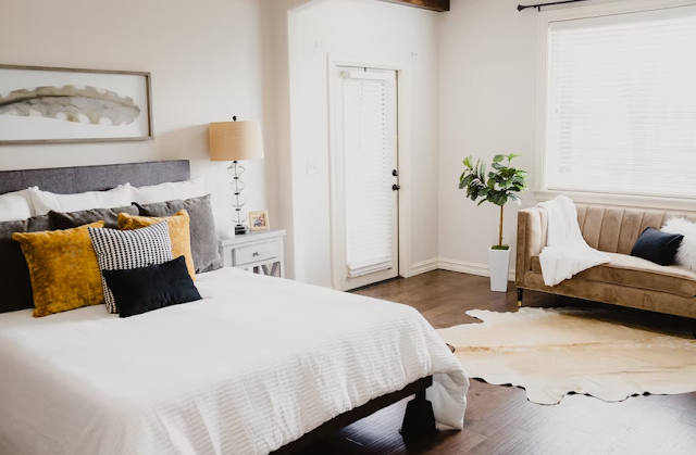
Four Aesthetic Ideas for Your New Bedroom Look

Redecorating is a task that is equal parts stressful and fun. In between all the admin of planning your renovations, booking handymen, and figuring out how to use certain tools for the umpteenth time, there is that same excitement that would take you over as a young child choosing their room colour for the first time.

Four Aesthetic Ideas for Your New Bedroom Look
Image Credit
Indeed, the way you choose to decorate can say a lot about who you are as a person, whether bright yellows for an innovative soul or light blues for an open, airy personality. If you find yourself stuck for bedroom decoration inspiration, you could always reverse-engineer these principles – right down to some core aesthetic values you hold. But what might these look like? Here are four strong examples with trendy pedigree:

Cottagecore

Cottagecore aesthetics have been taking the internet by storm in recent years, inspiring everything from Tumblr mood boards to outfits and even entire lifestyles. The “-core” suffix has been used to describe specific and niche trends or genres online for some time, inspiring some unique frameworks for aesthetics and style; cottage-core is one of the most popular, encapsulating a particular rural cosiness that comes from a traditional countryside cottage.

But how to incorporate this in your bedroom? Natural colours and materials are paramount, whether ‘raw’ linens and cotton or unvarnished wood furnishings. Rugs, blankets, and throws are a must, while matte neutral colours on the walls can help reinforce the cosy vibes.

“Soft Girl”

The soft-girl aesthetic is a close relative of cottage-core, having originated similarly and cultivated a similarly enthusiastic following. This time, though, the trend has emerged more fully on video sharing platform TikTok, as people share their fashion tips, shopping hauls, and, yes, their bedroom décor.

Soft girl aesthetics also have an element of nostalgia attached to them, harking back to the gel pinks and glitter of the early-00s. Pastel pinks and bright accents perk up a room in that familiar candy-gloss fashion, while maximalist displays of plushies and dolls fill out the space. Soft touches to your finishings, such as smooth surfaces and soft fabrics, gives you complete control over every aspect of your room’s colour, finish and feel.

“Boho”

Bohemian, or “boho” style has been around for generations now, and, like many other quintessential aesthetics, enjoys its peaks and troughs of popularity. While boho may appear to be on the downswing at the moment, interest in this hippy-influenced smart-slacker style is fast regaining ground. Bohemian chic is often defined by its worldliness; European aesthetic instincts meet Middle Eastern fabrics and textiles, to create a vibrant space that is equal parts vibrant and chilled.

“Indie”

Just as soft-girl aesthetics seek to capture a specific feeling through a snapshot of a time gone by, so too does indie aesthetic. Indie encompasses the best of alternative culture in the 1990s, from the grungy heights of Nirvana’s fame to The Strokes’ reinvention of New York rock ‘n’ roll.

Indie aesthetics are very much in the eye of the beholder and can signify either the quiet cool of early alternative rock or the countercultural swagger of leading underground artists. What they share in common are bold colours and a maximalist style not dissimilar in effect to soft-girl aesthetics – only using posters and alternative artwork instead of dolls and plush toys.


*this post contains PR samples and/or Affiliate Links unless indicated otherwise - you can learn more on my Disclaimer page.

Saturday, 15 January 2022

Things to consider when decorating

On my blog, I have shared quite a few updates on the decorating and renovations we have been doing to our home, starting back when we had to revamp the entire bathroom owing to a leak from a neighbouring property and with it the stress and angst over not having a toilet for what felt like months, but was actually less than a week - but something to think about if this is on your radar!
Thing to consider when decorating
Since then we have changed the front door, re-decorated the hallway, changed the flooring, decorated the lounge, installed new carpets and have almost finished the kitchen, it just needs some shelves putting up on the wall and we are currently in the process of getting some quotes to replace two of the windows where the double glazing units have failed and that means the kitchen is cold due to draughts and despite my best attempts to use excluders to keep the heat in, it still escapes. Heating the home is important, being energy efficient is something I am learning - not over-filling the kettle to make one drink, no windows open when the heating is on, a new boiler installation is a discussion we need to have further down the line, but it weighs on my mind that if I am trying to be as energy efficient as I can, then just replacing those failed windows might not be enough.

Throughout the whole time we have been decorating and renovating, we have learnt a lot of what about what we do and don't like, we chose colours we never would have picked (Pinterest has a lot to answer for), we have moved furniture around to make space, learnt the art of de-junking and our walls finally have some art work on them, now we just need to decide whether we do as friends have done and have a custom made neon sign, maybe with our surname on one of our walls to add a different dimension. 

As always, there is still more we could do.

So what else have we learnt?

  • Budget - Sounds really obvious but it should be the main focus of any work you decide to do.  We learnt this one early with a full bathroom renovation, if you don't stick to the budget, the odd purchase here and there quickly adds up and can take you on a slippery road to over-spending, which we almost did.
  • Colour Scheme - I found choosing colours hard. I have a Pinterest Board for every room in my house and can merrily spend hours adding item after item, but getting those testers from the shop to your wall is huge and for me, they never look like I expect them too.  So be prepared not to have that exact shade you have dreamed of on your wall, but something pretty close worked for me.
  • Accessories - It is easy to assume you will suddenly become a minimalist once everything has been decorated, painted or wall-papered, but instead of thinking that, make a list of items you need in each room, a list of items you do not need and a list of items that could be in that room but not necessarily a must-have.  
  • Storage - Where will the shelves go, What will the books sit on, where will those sentimental items go? We kept it simple and Ikea became our friend, we settled on a Kallax unit which gives us ample storage space for books, paperwork, ornaments and of course somewhere for the cat to sleep on should the mood suit.
We still have the bedroom to decide on decorating, it is the one room of the house which causes me the most stress. I like my safe space from the world, but it needs updating.  We need a new bed, I say that is most of these posts, but that is a minefield in itself, I feel like I need a degree in maths to figure out why beds don't come with a headboard or a mattress but cost a fortune.  But if we do decide to go there, it will be a whole other post.

Before we started decorating our home, I watched all those programmes which make renovations look really easy, I really wanted to buy an unloved shack of a house to bring it back to its former glory, but I have seen enough gloss to last me a very long time and there is still one door to go!


*this post contains PR samples and/or Affiliate Links unless indicated otherwise - you can learn more on my Disclaimer page.

Wednesday, 24 November 2021

Poster Store Black Friday Deals + Huge Discount

You might remember a post on my blog from a few weeks back when I shared an update on my kitchen renovation and some little touches I had added to the wall from Poster Store. Since then, we decided to change things around a bit and add to the collection and I’m so pleased with how everything looks.
Poster Store Black Friday Deals
At Poster Store there is a whole host of posters and frames on offer and they’re super affordable and because there is so many different themes to choose from, there is a category for absolutely every taste. I personally love the option of being able to create my own gallery wall or, based on the themes of the ones promoted on the website, work out which ones would work best for the colour themes I have chosen for my home.

For Black Friday, Poster Store is offering you, my reader up to 55% off and that is incredible timing because whether you want to switch round your current poster set up and perhaps opt for something more festive with Winter prints to work with your decor, such as the Fox In Snow poster which I absolutely love, or whether you want to gift some of these incredible prints to your friends and family, or even sprucing up a room in your home to get ready for hosting holiday celebrations!

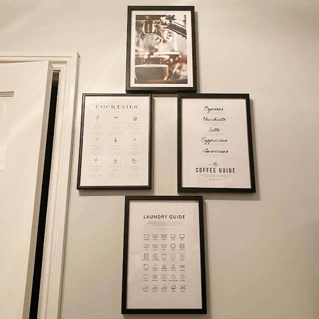
So what did I opt for this time? As we are still in the process of putting finishing touches to the kitchen - who knew finding hanging plants would be so difficult, we decided to add a few prints to the wall - French Croissants Poster (A4) and the Freshly Brewed Espresso Poster (A4) and then the very popular Laundry Guide Poster (A4) that finishes off the kitchen wall nicely. 
Poster Store Black Friday Deals
Then into the lounge where a gallery wall had been started, we decided to change up and then add a few more prints to what we have and again, this is where Poster Store is simply brilliant because of their size options - being able to really like a print and then choose a size which works for you is so important.
 
This is what we chose to finish our feature wall:
These prints will appear shortly once we have finishing painting the wall they will appear on, but currently, this is the layout we have chosen.
Poster Store Black Friday Deals + Huge Discount
Choosing the prints you would like is really easy and the posters themselves are sized in a variety of ways to suit your needs, better still, you can choose your poster by category, by room, by colour or you could just pick the ones you really like the look of. For me, Poster Store has thought of everything because as soon as you choose your print, you are presented with an option to also add the perfect sized frame to match your poster and that frame comes with a choice - Metal Frame, Gold Frame, Oak Frame, White Wood, Black Wood, Copper and more options.

As a reminder, all of the Poster prints I choose are printed with top quality inks on a FSC certified 200g/m2 premium design paper with matte finish and smooth surface and they look just absolutely stunning and they arrive really well packaged.

I would love to know if any of the prints I’ve chosen, or if any on the Poster Store sight have caught your attention!

Black Friday Offer

Code: BEAUTYQUEENUK55
55% on all posters (except Selection Posters and frames)
Not combinable with other discount campaigns. 
Valid from 24th of November to 1st of December.


*this post contains PR samples and/or Affiliate Links unless indicated otherwise - you can learn more on my Disclaimer page.

Tuesday, 19 October 2021

AD - Finishing off my Lounge Revamp with Desenio Prints

We recently decorated out hallway, the bathroom and the biggest challenge as lockdown set in, the lounge and now we are part way through the kitchen. Making small changes as the budget we have allows means everything takes time and it adds to that everyday stress and strife. In an effort to make our place more homely we decided that creating a gallery wall in a few rooms was something we wanted to play around with and having created one in the hallway which mainly features personal photos of family and our cats, we then felt the lounge looked a little lacklustre and not particularly welcoming, so I worked with Desenio to change that.
AD - Finishing off my Lounge Revamp with Desenio Prints
Desenio kindly gifted me a voucher to choose some artwork for my lounge walls and it was made so much easier thanks to the gallery wall tool that is free to use on the website. I chose a wall colour which is similar to my own and then the type of gallery wall I thought would work best. At this point, you are free to choose from a lot of options and once you have settled on that choice and style, it’s time to find your artwork.

I love an abstract style of art on my walls and there was such a huge choice to work with, that I am glad I could use the gallery wall option mentioned above. After a few hours of playing around with prints in different categories, I settled on four pieces that work incredibly well and ones which can be moved around into different gallery themes. 

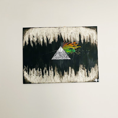
For years, the piece of art we had on the wall, shown below has been pretty much displayed on its own. As much as I absolutely love it, it doesn’t really have a theme or work with anything else we have owned.
AD - Finishing off my Lounge Revamp with Desenio Prints
So, the time has come to find it a new home, maybe in the hallway or even the bedroom.

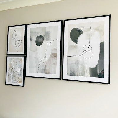
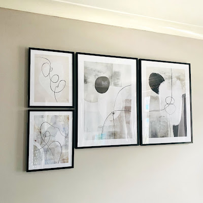
The first two piece of artwork work really well as a pair, so if I decided to change up my artwork, I could keep them together or have them on opposite walls. Painted Shapes No.1 - this is an Illustration with abstract shapes in black, grey and white with an uneven colour effect. Then we have Painted Shapes No.2 - this is another Abstract illustration with grey, white and black shapes with an uneven colour effect.
AD - Finishing off my Lounge Revamp with Desenio Prints
The second two choices I also feel work well together and again, for the same reasons above. Artful Lines No.1 - this is a graphic illustration with a thin, black swirl with a light grey shape behind it, all on a beige background. Described as being a minimalistic illustration that will fit well in both living rooms and bedrooms. Then with Abstract Paint Figure No.2 - A painting with abstract lines in black and white on a grey-beige background. The neutral colours make this print a perfect addition to all kinds of interior!

There is just so much choice with Desenio and it gives a lot of options should you want to change your artwork up at different times of the year or even if you love re-decorating that much you want to change your artwork too! Prices with Desenio are incredibly reasonable starting around £4.95 rising upwards depending on the size of your print. 


*this post contains PR samples and/or Affiliate Links unless indicated otherwise - you can learn more on my Disclaimer page.
Sunday, 3 October 2021

Bringing life to my kitchen with Poster Store + giveaway

Aside from beauty, cats, books and the odd Instagram post on plants, all of which are important to me, I am very much a home bird, I like being at home in my own space amongst my own things, possibly the Cancerian trait, of which I most definitely am. Lockdown for me, was possibly not as hard or wearing as it has been for others, but we did decide to redecorate our home, having now completed the bathroom, hallway and the lounge we turned out attention to the kitchen - a room that has definitely needed some TLC.
Bringing life to my kitchen with Poster Store + giveaway
The Poster Store kindly got in touch and asked if I would like to work with them and selected some prints for my wall, which worked really well with timing because I had been looking for something for a wall on my kitchen and spookily it was with Poster Store! Poster Store if you have never come across them is an online shop which sells an incredible selection of wall art in a variety of sizes with accompanying frames, should you want them. Keep reading for your chance to win a voucher worth £80 to spend with Poster Store plus, for the entire month of October, if you use the code beautyqueen35, you can also get 35% off posters - terms and conditions below. 

Our kitchen has been transformed from being the brightest yellow shade of paint you can ever imagine when we first moved in, to a shade called Chinese Jade which I absolutely loved and now it is called Polished Pebble, a light chalky grey shade which has really brightened the space up, it works with the existing tiles we have and thankfully with the posters that I chose for the wall.
Bringing life to my kitchen with Poster Store + giveaway
With Poster Store, there is a lot of choose. The posters themselves are sized in a variety of ways to suit your needs and you can choose my category, by room, by colour or even get some help looking at other inspired Gallery Walls - this is where I think I inspected every single idea someone else had come up with and immediately wanted to change every picture I have up on my wall in other rooms! As I was looking for a few pictures for my kitchen, after a few hours of playing around with ideas, I settled on a handful of prints which I thought would work.
Make your kitchen shine with the perfect posters! We offer beautiful wall art with guides to wine and coffee, as well as vegetables and meats. Perfect to combine with our charming quotes and funny and tasteful photography. We have fitting posters for your kitchen in both colour and black and white.
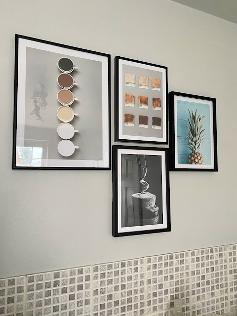
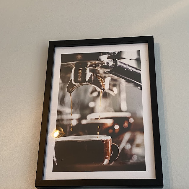
The first poster I chose was the Coffee Shades Poster, perfect for my colour scheme and always a talking point with friends, family and colleagues as to what is an acceptable shade to have your coffee and this poster which was 30 x 40 is priced at just £8.42 and then you get to choose whether or not you want a matching frame to display your art work in, again this comes with a great deal of choice with regards to the colour of your frame and the material you prefer - wood, metal or even a hanger.  Keeping with a similar theme to the Coffee Shades Poster is the Toasts poster and again, another issue we discuss a lot in this house is 'how burnt is too burnt' when it comes to using the eating it. For this poster I chose a slightly smaller size of 21 x 30 so it can sit beside the Coffee Shades poster and then keeping with same size I went on to choose the Blue Wall Pineapple Poster, Wine O'clock followed by two posters which are based on words rather than prints.

The first worded poster is the Cocktails poster, anyone who knows me will know I do love a good Strawberry Daiquiri or a Sidecar so this one really appealed and it looks incredible in its frame.  The second option I chose is coffee related and it is a Coffee Guide Poster which details how to make different coffee from an Espresso to an Americano.
Bringing life to my kitchen with Poster Store + giveaway
All of the Poster prints I choose are printed with top quality inks on a FSC certified 200g/m2 premium design paper with matte finish and smooth surface and they look just absolutely stunning.

Competition

The lovely people over at Poster Store are giving one of you the chance to win a voucher worth £80 to spend with them.

The conditions of the blog competition would be as follows:
  • You must follow Poster Store on Instagram
  • All entrants must comment on this blog post, using more than 8 words, to the following question: Which is your favourite poster at Poster Store and where would you display it? Please leave your Instagram name on your comment.
  • Follow Beautyqueenuk on Instagram
The winner of the competition will be chosen 5 days after this post goes live and will be contacted by Poster Store.  The conditions of the competition laid out above must be followed or your entry will be null and void and there is no cash alternative to this prize.

Terms and Conditions for use of the code

Code: BEAUTYQUEEN35
- 35% on all posters (except Selection Posters and frames)
- Not combinable with other discount campaigns.
- Valid from 3rd October until 3rd November.


This competition has now ended and the winner has been contacted! Stay tuned for another one coming soon!


*this post contains PR samples and/or Affiliate Links unless indicated otherwise - you can learn more on my Disclaimer page.

Monday, 25 January 2021

Making Your Own Bedroom

If your home’s décor is still the same as the day you moved in, you may be keen to make your house truly you own. By adding colour and style you’ll be able to finally personalise your pad. And no where is this more important than in your bedroom. A space that should feel like it’s yours. So how do you make your bedroom your own?
If you’re like me, you’ll probably want to create your own dressing area. Most of us don’t have the space for a separate dressing room, but that doesn’t mean you can’t use part of the bedroom for this instead. You might need to reconfigure your existing bedroom furniture first. And you’ll need to create it in a corner or area where there’s plenty of light, so you can see to apply your make-up and so on. Your dressing area could feature a dressing table, clothes and shoe racks, and perhaps an occasional chair or full-length mirror too. Try to tie it all together with a colour scheme or style.

Why not get yourself a designer bed for elegant nights in? If a new bed isn’t within your budget, you can restyle your existing bed to give it that designer look. Making a bed look stylish isn’t as difficult as you might think. If you have a detachable headboard, you could upgrade this for something more on trend. The rest is down to how you dress the bed. Layering up the covers is the secret to making it look the part. And plenty of extra pillows and cushions.

Going dark and moody with your décor can add a grown-up and sophisticated vibe to your bedroom. There’s a growing trend towards painting bedrooms in matt black, dark blues and dark greens. If you like a colour but think the bedroom will be too dark, try painting a single accent wall instead.

The only downside to painting dark colours is getting a decent finish with your paint. Brush and roller marks can show up, so you might prefer to hire a decorator. If you don’t fancy getting your hands dirty (and who does), have a look to see what the painter and decorators day rates are like in your area. 

And lastly, no bedroom will feel personal without something on the walls. Bare walls don’t feel very homely or stylish. Choose a set of pictures that reflects your tastes and hang them together in a grid formation for extra impact.


*this post contains a paid for link, PR samples and/or Affiliate Links unless indicated otherwise - you can learn more on my Disclaimer page.
Saturday, 28 November 2020

Storm Glass - Does it really predict the weather?

As Brits, a lot of our talk is about the weather, it is just who we are. Conversations naturally flow with asking "What's the weather like where you are" and "Blimey it is cold" often keeping us entertained without even knowing about it. I am possibly more obsessed than most with the weather because I suffer with headaches which are called Barometric Headaches, they occur after a drop in barometric pressure. The headaches, which can turn into a migraine often come with additional symptoms, including: nausea and vomiting. increased sensitivity to light. So, I am always aware 
Storm Glass - Does it really predict the weather?
I was sent a Storm Glass by Kikkerland, oddly something I had always looked at in stores such as Waterstones because they fascinate me, the first one I ever bought was broken in its box, so it never got used.  The Storm Glass is said to have helped Charles Darwin predict the weather and whilst the original inventor is unknown, but it was re-invented promoted by  Admiral Robert Fitzroy who was the Captain of Darwin's HMS Beagle, in an effort to predict the weather and save the life of sailors who had to tackle the rough seas. Such a glass is now often referred to as Fitzroy's Storm Glass.

Chemistry at school was not one of my strong subjects, I got by with a dual award B in my exams and that was the last time I even looked at compositions and anything related to such a subject. However, a Storm Glass is described as being a cylinder which is filled with a mixture of water, ethanol, potassium nitrate, ammonium chloride, and camphor (no sign of the magnesium ribbon I used to set on fire for fun in the lab). Fitzroy believed that the formation and dissolution of crystals and particles in the mixture reflected temperature and pressure and therefore, in its own way predicted the weather.

This Storm Glass comes sat on a base of beech wood, with a hole perfectly shaped for the cylindrical piece of glass to sit in, easy to put together, we have ours on the book shelf and without thinking about it, we both check it numerous times a day and make comment. 

So how does it predict the weather? 

Inside the Storm Glass are some crystals which more around into formations to help you work out what the weather will be like and it is scarily accurate:
  • If the liquid remains clear - the weather will be fair
  • If the liquid becomes Murky - rain is coming
  • If the crystals have formed at the top of the glass - Thunderstorms are coming
  • If the crystals are large and flaky - It will be a cloudy day
  • If the crystals are joined together in a thread - It will be windy
I find it absolutely fascinating to watch as the crystals within the sealed glass chamber cluster or disperse with changes in air pressure or temperature and it has come some way to help understand my headaches, though of course there is no cure, other than a dark room and an eye mask.
Storm Glass - Does it really predict the weather?
I think this is a really lovely, if some what quirky as a gift and this Storm Glass can be found for around £19.99 on Amazon* and they do come in all shapes and sizes too.


*this post contains PR samples and/or Affiliate Links unless indicated otherwise - you can learn more on my Disclaimer page.

Sunday, 15 November 2020

Wall Art, Posters and Framed Prints - For the Home

(AD) Having just decorated a third of our house, we are still in the midst of adding some finishing touches, trying to combine hanging framed prints and our wall art between working from home, zoom meetings, ensuring the cats get some attention and trying to find time to relax is quite time consuming, especially as we still want to decorate the kitchen this year as it looks a little tired and dated - the bedroom can wait!
Wall Art, Posters and Framed Prints
When it comes to wall art, thankfully the mister and I both have similar tastes , whilst we would both love to own some original pieces by Dali, it is not a position we are likely to ever be in, so we tend to stick to the more abstract wall art pieces and he has even taken up painting himself, so around the house we plan to display some of those pieces.  We did look at using Bumblejax Acrylic Photo Block as as way to show off some of our art work, I love that they can change the look of your works of art to 3D giving you the option to hang them or stand them on mantlepieces, book cases or even shelves around your home.

On our walls before we decorated in the lounge we had just two pieces of art featured, both of which I have shared on my Instagram many time.  As the decorating started to take place, we need to find new homes for them - one is more abstract than the other, but we bought them with money we had been given as a Wedding Present many years ago and I really want to see both of them hanged somewhere.

We have both always wanted a feature wall of sorts, but instead of using paint or wallpaper, we wanted to use art and with the lounge set up we have, realistically, because it is a short L-Shape, we only have one wall that we could use, which wouldn't be too much of a distraction of the cats. Before we move onto the lounge, we decided to deal with the hallway first. In there are family photos and prints we have taken and collected over the years and have never quite known what to do with them.  So, I bought a whole lot of black frames so there is some continuity and then having laid it all out on the floor, we have hand drawn a plan as to what it might look like and so we can change them round before we hang them on the wall.

I'm clearly no expert at all of this home decor stuff, I have watched others do theirs, read websites on how to create feature walls and pretty much have done my own thing, once it is all done and dusted - the task of Lockdown 2.0, I will share it with you.  But I know some of you are pretty good at this kind of stuff, so if you have tips, find a way to message me, direct me, what goes where or can I just be a bit alfresco about it and do what I want?


*this post contains PR samples and/or Affiliate Links unless indicated otherwise - you can learn more on my Disclaimer page.

Saturday, 19 September 2020

Decorating my home on a budget

Renovating your home isn’t an easy job, despite the numerous house makeover programmes over watched - Homes Under The Hammer and my favourite Property Brothers with Jonathan and Drew Scott, nothing is ever as straightforward as it should be.  When we first moved into our home, the one thing I was adamant that was happening was the hiring of professional cleaning services London, because as I have mentioned before, the home we bought wasn't left in the most desirable state. Since then, everything we have done and have achieved, we have paid for and that makes me feel quite proud, though the list to complete is seemingly endless!
Decorating my home on a budget
Since November last year we have renovated the bathroom which was part paid by our insurance because there was a leak coming through from the upstairs flat into ours and not only did it cause a whole host of mess and holes everywhere, the solid wooden flooring all lifted and it was just horrendous.

Since then we have gone on to redecorate the hallway, partly because of the water leak, with that came a new front door, again because of the water leak and then fixed flooring, painted walls and now a photo wall - finally finding somewhere for the family photos that we have to go. 

Now the lounge, a Lockdown project is almost finished. I say almost because the new flooring has gone down, the painting is done but a few touch ups are needed, bookcase is finished, new rug, new clock, new lamp, new heater cover and artwork almost all up on the walls. New sofas have finally been ordered and once they are here, in situ and hopefully as comfy as they look - yes they were a blind purchase, everything will finally come together.
Decorating my home on a budget
As ever, you start with one thing and the list gets longer, things don’t match and need to be replaced and it is these “things” that add to your budget. We now need:
  • Three new light fittings - one for the hall and two for the lounge
  • A few floating shelves for more artwork to go on
  • A mirror 
  • New curtain poles
  • New light switches
  • New sofa cushions/throw
I’m sure anyone who has done any renovations will Have some sympathy with me and this entire subject.  The one thing I am glad about is that the glossing is complete and that won’t need to be done for a few years yet.

Just the kitchen and the bedroom to go and then everywhere has been updated - saving the two most awkward rooms till last.

Is there anything about home decorating that you enjoy?


*this post contains PR samples and/or Affiliate Links unless indicated otherwise - you can learn more on my Disclaimer page.

Friday, 28 August 2020

Home Renovations - The Lounge

We (the mister and I) have been saying we want to decorate the lounge for some time now and like moving house, it is a stressful job.  Having done the bathroom and the hallway, we are now pretty much finished decorating the lounge, leaving just the bedroom and the kitchen to do.
The lounge we have is almost L-shaped and being on a main road, having the windows open does naturally affect the paint on the walls giving it a dull dirty look. When we first moved in here, not only did we have to hire some end of tenancy cleaners because it was a state, the previous owner helpfully painted every single wall a bright shade of yellow, so to tone it down with various undercoats and then a neutral shade of magnolia. Now, we have Dulux Perfectly Taupe in its place.

As with any sort of decorating, you start in one place and find a whole host of other problems that creep up.  The main one for us is the carpet, underneath we the underlay we have found laminate flooring, so it will need to come up because in some parts it has pretty much wasted away, so a carpet, two layers of underlay and some laminate to remove.  Now we are waiting a date for the new carpet to be installed in the next few weeks, which means I can't keep procrastinating instead of doing the glossing.

Hopefully by the end of next week we will have found a a new sofa and then got everything in place so life can go back to normal and we can enjoy our new living room.

Have you done any decorating and DIY over the last few months?


*this post contains PR samples and/or Affiliate Links unless indicated otherwise - you can learn more on my Disclaimer page.

Thursday, 6 August 2020

Home Renovations - The Hallway

I have enjoyed sharing some of my hopes and wants for renovating our home on my blog, admittedly the majority of my ideas stem from Pinterest where I can lose hours procrastinating over what I can do to my little sanctuary to make it even better.
Home Renovations - The Hallway
After renovating the bathroom due to a leak, which also spread to the hallway and damaged the ceiling, a wall and the floor, we had a choice to make. We either patched up the damage and hoped for the best, or we did an entire re-plaster, repaint, sort the floor out job and do it properly the first time so it would last longer.

So we opted to do everything properly the first time round. The walls are re-painted white so add as much light as we can, the engineered wood flooring has been sanded down and varnished, though I had hoped to change it, other issues became more of a priority like a new front door.  So by sanding and varnishing, we have managed to save the floor.  

That just left the walls, having re-plastered and then painted, we now had the option to create a feature wall with photos and other memories to display. So,  having ordered a whole lot of picture frames which are all the same but different sizes, we have just started to create it and I am pretty impressed with how it is taking shape and if you follow me on Instagram, you will have seen sneak peaks as to how it is shaping up.

All we have left to do now is gloss the skirting boards (does anyone actually like this job), get a new internal door mat and then decide on a shoe rack, something that isn't too wide/takes up too much space.


*this post contains PR samples and/or Affiliate Links unless indicated otherwise - you can learn more on my Disclaimer page.

Saturday, 16 May 2020

DIY during Lockdown!

At the start of the lockdown, I am sure I wasn't alone in creating a list of things to do around the house. Having had the bathroom renovated, it has been one huge tick off the list of things to do, but that list has definitely grown, possibly because I have spent hours of my time sitting in different rooms and as I work, notice the odd thing that needs fixing and changing, but again, without the ability to purchase most of what is needed or have someone come in to do the jobs we can't tackle, that list will have to keep on growing. So with a new bed needed, mine is currently held together with gaffer tape, a new wardrobe, a new sofa and a new light fitting in the lounge...that list will continue to grow.
DIY during Lockdown!
The first job on the list is to replace the hallway flooring, this would have been done when we decorated the hallway but it was deprioritised knowing workmen would be in and out to do the bathroom. We have decided on solid wood flooring and are in the process of ordering samples to see which would look best, the only light that we have comes via the glass panel in the door, so anything that is dark will make the hallway look much smaller. As well as the flooring we will also need to change our skirting boards because they are the wrong colour to match the flooring and one of them is slightly damaged from the water leak. 

Over the last few weeks, I have taken to reading websites which offers advice when it comes to changing your flooring, which we have only done with one room since we purchased our home over a decade ago! So some of those tips and advice include:

1. Samples - As with buying your wallpaper, samples are really important. Whether you are buying your flooring online or in-store, those pictures and the lighting will be different from what you have at home. When I bought the flooring for the bathroom, I must have ordered over 50 different tile samples as well as taking cuts from bathroom stores when I went to purchase other items and ultimately, we ended up choosing the type of flooring I said I didn't want - tiles in this case, because it looked the best So, it is worth looking to purchase from companies who offer samples, which most do and many offer them free of charge too.

2. Budget - As with any renovation, a budget is hugely important. When I did my budget for the bathroom, I was lucky enough to have a family friend work out what absolutely everything I wanted would cost to give me a baseline to work with and then from that point, I could remove the items/work that I really didn't need.

3. Flooring Type - The floor you choose might be absolutely stunning, but is it practical? We have two cats and one of them loves to scratch wood (a new internal door is on that growing list above) so the flooring we choose needs to be durable and practical because as well as the animals, the mister will also be dragging his fishing trolley and items along it too and the space under the stairs, is used for storage, so it needs to be able to cope with that, without becoming warped.

4. Underlay - This came as a bit of a learning curve for me because I assumed underlay was an issue for carpets, naive I know.  The underlay you have might be in need of replacing, it certainly was in our bathroom, in fact, it looked more like used cardboard boxes than proper underlay and that was a cost we hadn't factored into the renovation. I dread to think about what I am going to find under the kitchen tiles when the time comes to replace those!

5. Measuring - This is really important and definitely another learning curve for me. The M² measurement becomes important and can also affect your budget, so depending on how much flooring you need can change how much money you have to spend.  Again, I was lucky that someone else did my measurements and came with me to make the purchase, otherwise, I am sure there would have been a lot left over when doing it properly in the first place meant I have a few tiles left should I need them at a later stage.

So, whilst I haven't managed to tackle every single job on my DIY list so far under lockdown, I have cleared out cupboards, organised carrier bags, spring cleaned, changed lightbulbs and planted vegetables and flowers, I have at least made a list and ordered some flooring samples!  Have you managed to complete any DIY tasks?


*this post contains PR samples and/or Affiliate Links unless indicated otherwise - you can learn more on my Disclaimer page.
Everything written here is done so by the blog owner and it may appear elsewhere.
All content and images © Beautyqueenuk unless otherwise stated. Blog design by Beautyqueenuk